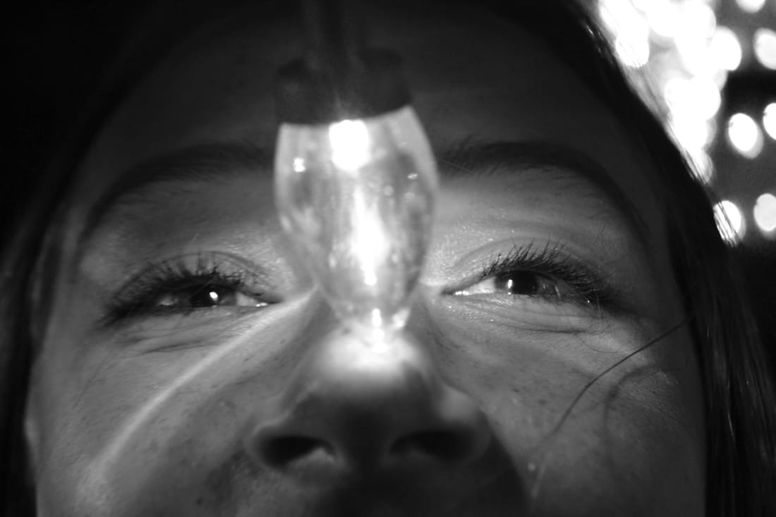
 This week I finally wanted to focus on black and white. In this picture the way that everything is focused except the light and the background is really nice to me. I also enjoy how I captured the person in the photos intent with the lights. I think that this photo shows the joy of Christmas through an adolecense's eyes, the excitement that's held throughout the year even though the magic kind of dwindles it's still a fun time of the year to look forward too.
0 Comments
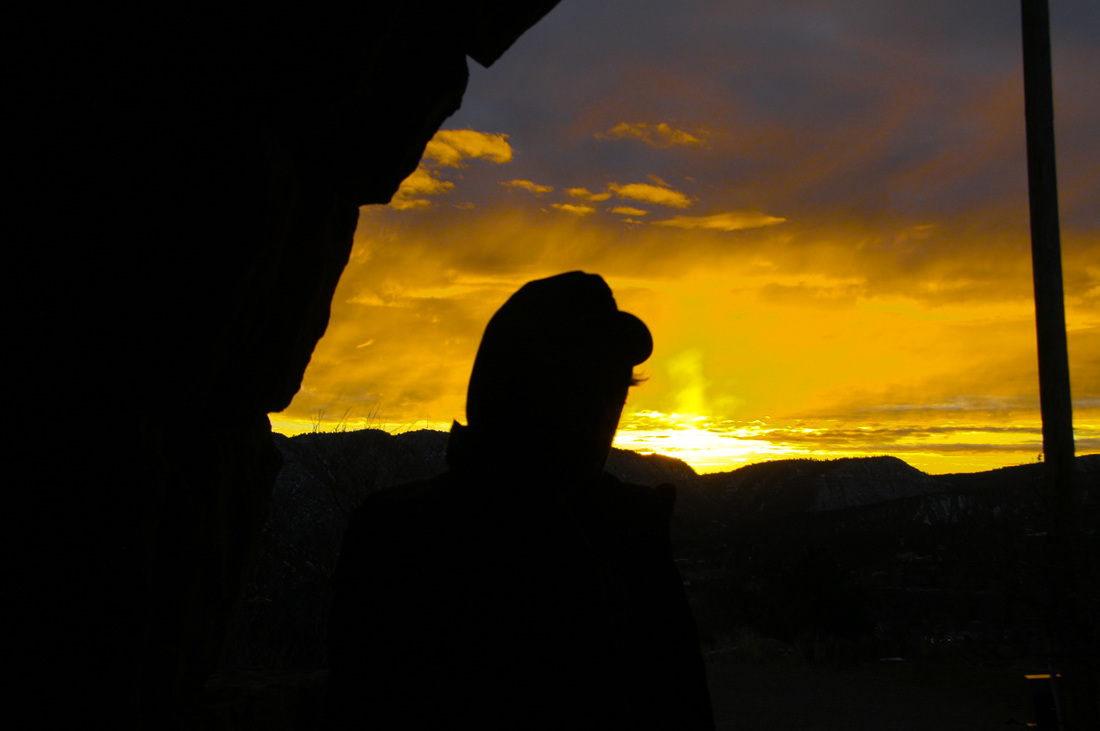 This week I focused on the color yellow. I really enjoy this picture, the shadows with the contrast of the sunset makes it look so pleasing to the eye. As well as the shadows I highly enjoy how the clouds look with the picture, also the brightness that the left over sunlight gives. To make the yellow pop I brightened the hue and made the shadows darker.
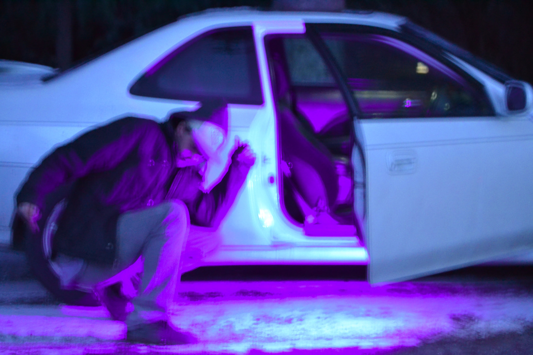
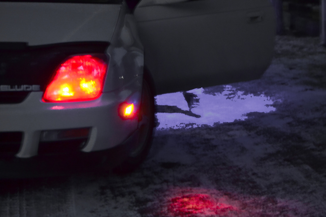
This week was very fun. I ended up redoing my purple, red and got the color grey out of the way. Once again I wasn't fully sure what colors I wanted for the week so I was just going with the flow. That is until I found out my friend was matching, and another had a bunch of cool colored lights on his car. So, at the end of the night I had a bunch of cool pictures and knocked out more in the week then I normally would.
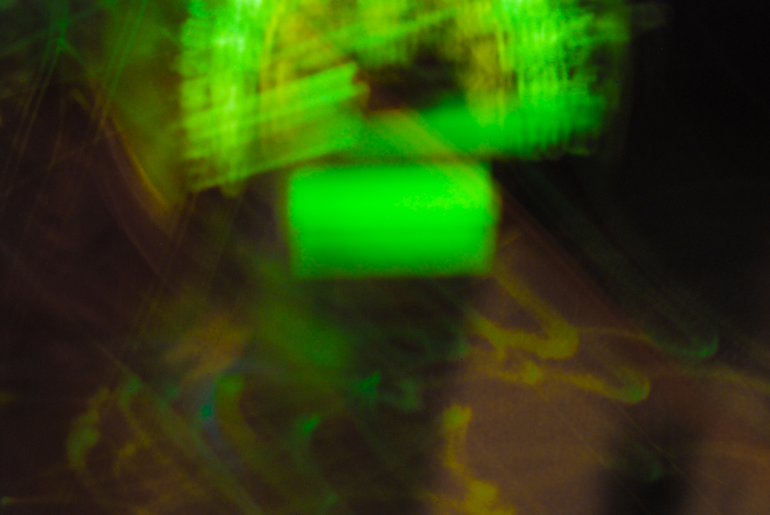 This week I focused on the color green. This is a picture of a cars speed thing with a long exposed lens. The green wasn't sticking out as much as I wanted so I had to brighten the green on the picture. There's also red on the outsides of the picture and was drawing away from the green so I had to dull that color down. I didn't do much to the picture accept brighten the features of the picture but I like how it turned out.
This week in the editing process I had lots of fun. I had to mess around with the app quite a bit to get the colors and contrasts that I wanted for this picture. The original picture did not have the colors that I wanted for the week but it was the picture that I wanted. So, I had to manipulate the picture and it's hue to get what I want. the colors were originally a purple house with a plain brown fence in the picture but I wanted a little bit more pop, and I've already done purple for my portfolio pictures. Throughout my process the house ended up having a blue hue and fence with a purplish brown tint. I personally enjoy how the picture went.
 This week turned out very interesting. This week I was going to focus on orange but during the photo shoot process I figured out how to adjust the lighting to make my walls look pink, realizing that I've already done pink I decided to manipulate the color into a light purple. Adjusting the lighting and altering the hue slightly the picture came out with a very nice purple color. I wasn't expecting how this work turned out but I like it and it's another color knocked out for the week.
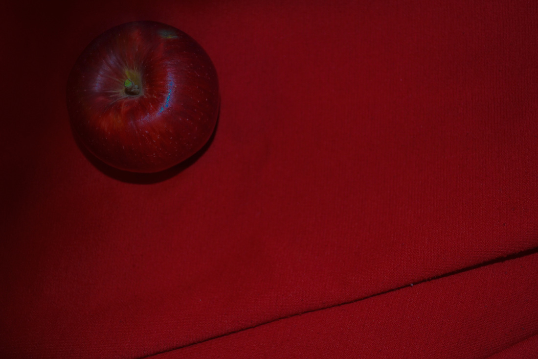 This week was very simple, plain but popping colors is what it's all about. The statement this photo is giving off is that even if you're simple and blend in with others it doesn't mean you aren't your own person that is different from the rest. Before this photo was edited that blue shaded line wasn't visible. By editing it and having that little surprise pop I thought I'd keep it and embrace the little pop of color. The two colors of red are very similar making an eye pleasing but simple picture.
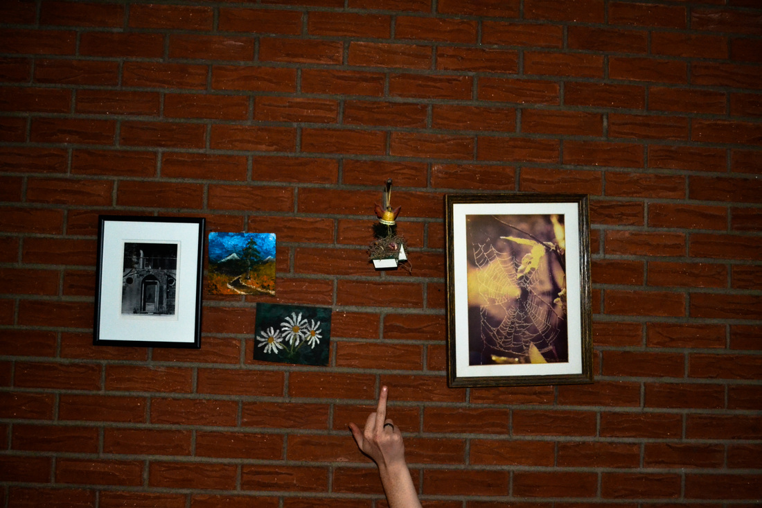 This week aside from doing my portfolio pictures, I got to take some other jazz that might toot your horn. This piece was the favorite of the weeks work. I haven't quite figured out what it stands for just yet but I just really enjoy the look and feel of that the photo gives off. It's just a nice photo and the statement being placed under the picture makes it even better if you ask me. I like how all the objects in the picture are crooked except for the hand making stand out more. The way that the outside corners of the picture get darker makes somewhat of a spotlight on the objects in the middle of the picture.
For my portfolio this semester I would like to focus on taking pictures with a color theme to the picture. Each week trying to focus on one color and after the nine weeks of photography having a rainbow looking arrangement in the end. In my process of making my padlet I forgot my user name so the actual theme that I decided to go with isn't on the padlet but my other ideas are on there.
https://padlet.com/wall/c2xnihdjqipx Copy and paste in another tab to see my ideas. 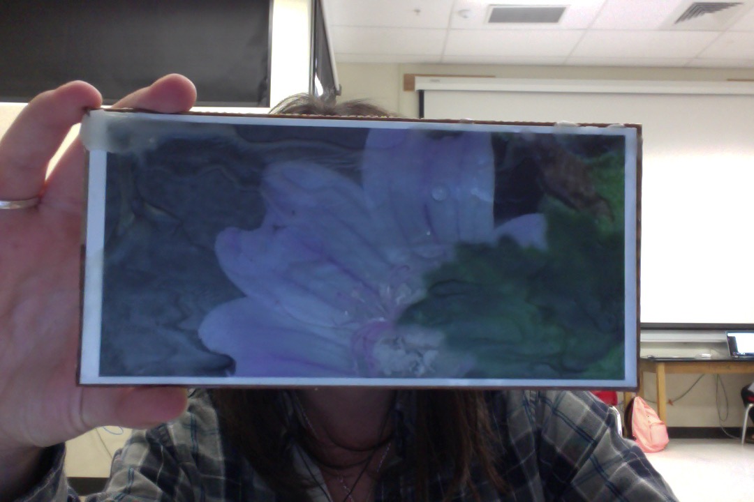 5 step critique: In this picture it is a zoomed in image of a flower, it's color is a light pink. The flower is partially blocked by one of it's attached stems. There are some water drops towards the center of the flower drawing some extra attention. Added onto the printed picture is a wax layer put over the image, some places are thicker then others. In the top left corner it is the thickest layer going off the picture, it gives it an effect of the petals melting in a way. The element of art used in this photo is texture, the picture already has a nice textural addition to it but the added element of the wax I believe takes it to another level. The principles of design that were applied to this picture is focal point, or emphasis, the photo was more zoomed out in the beginning but I cropped it to where the flower was more noticeable. I believe this photo has a message that says anything can catch your eye but you have to look closely to find the true beauty of an object. Personally I enjoy the artwork, the quality could be a little bit higher but I somewhat enjoy the slightly blurry photo. To improve this photo I would put it on a better quality back ground other then a piece of cardboard but it still made it work. I would and will be planning on hanging the artwork at my house because I believe it is nice piece of work, as for a gallery I would only display it if it had some better quality attributes and improvements. 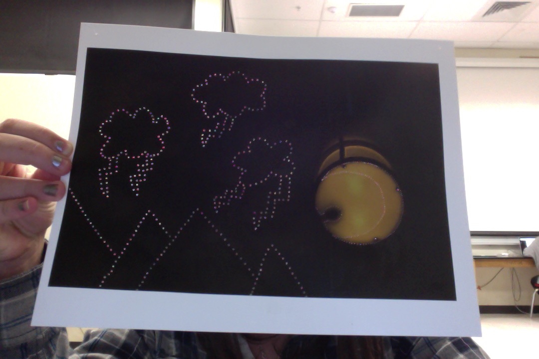 5 step critique:
In this picture it was just a regular light with black all around. Looking at the picture I noticed the shadow in the light looked somewhat like the outline of a person, so I decided to poke small holes to outline the figure, then the idea popped into my head to add a crescent moon so it would be like the man in the moon. Then next to the light I added larger holes in the shape of clouds and lighting at the top half of the picture and at the bottom mountains to fill more space. In this picture I used the element of space, there was a large amount of unused empty space in the picture and I manipulated it. For the principles of design I used unity, I used unity because all of the added elements in the picture don't necessarily make sense all together but they're put together in a way that works. This piece of work has the message of even though something may not sound like it'll work you always have to give something a chance for success. I think this piece of art is very interesting, the only thing I would chance about this picture is a few placements of some misplaced or unnecessary holes put into the picture. I would and will post this up at my house and probably wouldn't put it up in an art gallery because I probably enjoy it more then others might. |
AuthorHighschool sophomore at Durango Highschool. Archives
December 2016
Categories |
 RSS Feed
