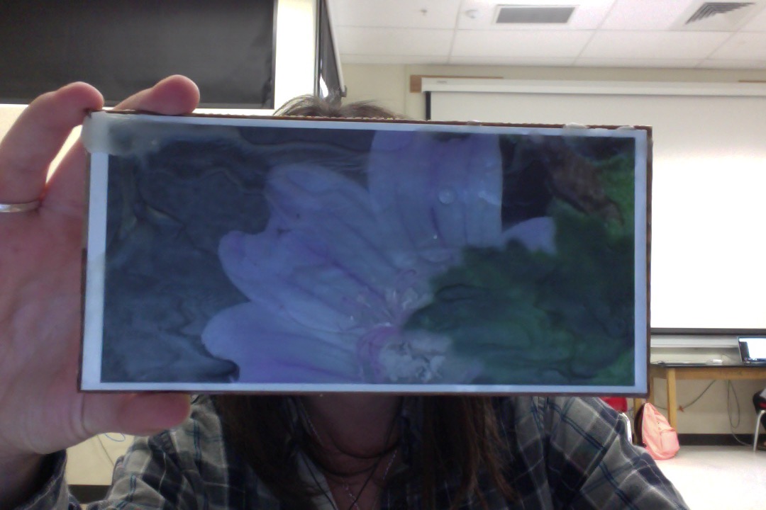
 5 step critique: In this picture it is a zoomed in image of a flower, it's color is a light pink. The flower is partially blocked by one of it's attached stems. There are some water drops towards the center of the flower drawing some extra attention. Added onto the printed picture is a wax layer put over the image, some places are thicker then others. In the top left corner it is the thickest layer going off the picture, it gives it an effect of the petals melting in a way. The element of art used in this photo is texture, the picture already has a nice textural addition to it but the added element of the wax I believe takes it to another level. The principles of design that were applied to this picture is focal point, or emphasis, the photo was more zoomed out in the beginning but I cropped it to where the flower was more noticeable. I believe this photo has a message that says anything can catch your eye but you have to look closely to find the true beauty of an object. Personally I enjoy the artwork, the quality could be a little bit higher but I somewhat enjoy the slightly blurry photo. To improve this photo I would put it on a better quality back ground other then a piece of cardboard but it still made it work. I would and will be planning on hanging the artwork at my house because I believe it is nice piece of work, as for a gallery I would only display it if it had some better quality attributes and improvements. 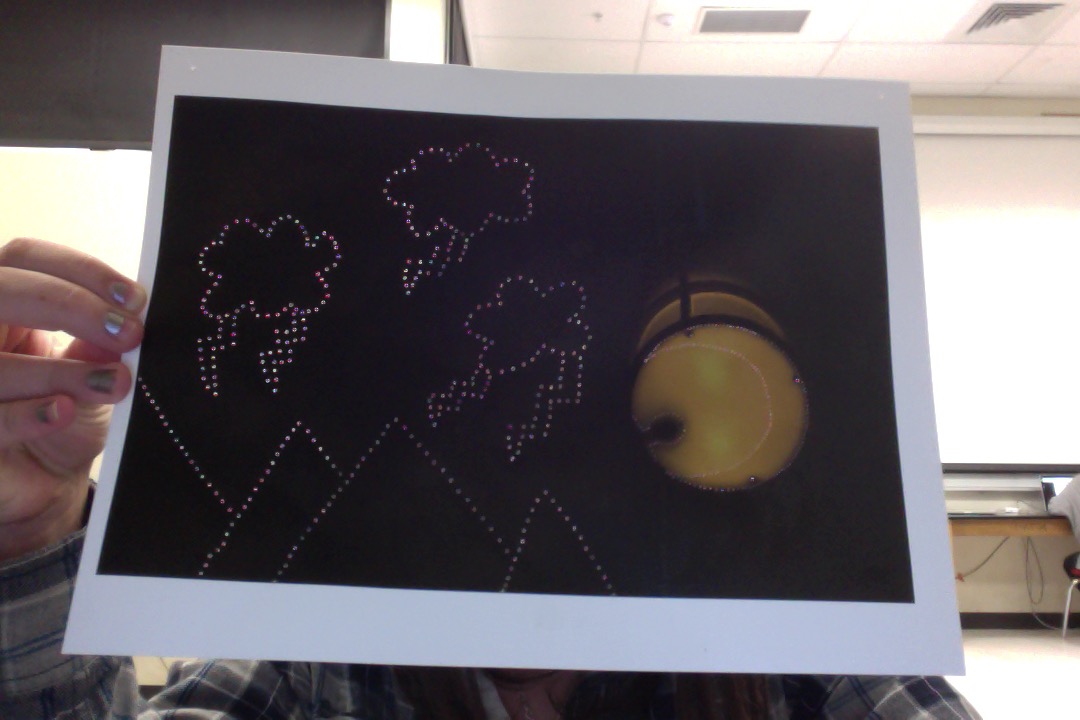 5 step critique:
In this picture it was just a regular light with black all around. Looking at the picture I noticed the shadow in the light looked somewhat like the outline of a person, so I decided to poke small holes to outline the figure, then the idea popped into my head to add a crescent moon so it would be like the man in the moon. Then next to the light I added larger holes in the shape of clouds and lighting at the top half of the picture and at the bottom mountains to fill more space. In this picture I used the element of space, there was a large amount of unused empty space in the picture and I manipulated it. For the principles of design I used unity, I used unity because all of the added elements in the picture don't necessarily make sense all together but they're put together in a way that works. This piece of work has the message of even though something may not sound like it'll work you always have to give something a chance for success. I think this piece of art is very interesting, the only thing I would chance about this picture is a few placements of some misplaced or unnecessary holes put into the picture. I would and will post this up at my house and probably wouldn't put it up in an art gallery because I probably enjoy it more then others might.
0 Comments
Leave a Reply. |
AuthorHighschool sophomore at Durango Highschool. Archives
December 2016
Categories |
 RSS Feed
